When the electrification trend exploded, it knocked down more than just combustion engines. It drove a stake right through OEMs’ brand identities, forcing them to review their image. Inevitably, this dramatic change led carmakers to reassess their logos – core symbols of a company’s identity – not just in their design, but also on their treatments. I’ll be citing some recent changes as well as examples of carmakers who haven’t stopped at the blue lines=electric design cliché. Here’s an overview of the most prominent trends in automotive logo design.
Bye-Bye, Chrome!
The chromed logo has been around ever since the invention of cars. Durable and versatile, its popularity steadily increased. Long associated with premium-ness and quality, the use of chrome finishers on vehicle exteriors has gradually been reduced. Many carmakers now only use it as a shiny band over the DLO, a stark contrast to the swathes of chrome used in vehicle designs of the 1960s and ‘70s.
Chrome plating has also been under increasing scrutiny from the automotive industry due to its environmental and health disadvantages. No wonder that CMF designers benefit from the electrification trend to substitute the chrome finish with more sustainable alternatives.


Minimalist to the core: The Polestar emblem blends with the body – white, grey, black or blue, it always matches the exterior color.
Over the past few years, we’ve seen a decline in the use of chrome in logo designs as well, which has begun to favor more muted, flat solutions.
Clean and Subtle
Polestar certainly has the most radical approach to its logo’s appearance. The brand has chosen to skip the classic chrome effects on the exterior, favoring less flashy solutions. The polar star symbols on the front and rear are in body color, so it’s almost invisible except for the subtle shadows it creates on the surface of the car.
Polestar also borrows a typographic technique from print and digital design. Discreet stickers along the exterior of its models highlight some of their top features.


Another bright example is found on the Lucid Air: its logotype is part of a large stripe visually connecting the hood to the front lamps. The embossed letters possess the same satin finish as the main aluminum plate. This treatment gives a monolithic appearance to the front by eliminating any distractions – a skillful balance between clean design and thoughtful details.
Old World vs New Wave
Young companies such as Lucid and Polestar use their lack of historical restraints as ‘carte blanche’ for CMF innovations. Conversely, retaining brand identity and heritage is the hardest task for a company looking to make an emboldened move into the future.
Kia’s recent logo redesign speaks of a company on a mission to completely redefine itself. The bold letters – done exclusively in black and white – are canted slightly forwards, alluding to momentum and progress. Indeed, the company has outlined its new brand slogan as ‘movement that inspires’.

General Motors is also on a crusade to redefine itself as a mobility provider. The company recently presented its new corporate logo that combines lowercase letters and an underlined ‘m’ (said to represent a plug), which highlights the automotive manufacturer’s commitment to its electric future. The new corporate logo was met with mixed reviews, though many questioned GM’s aesthetic direction and apparent decision to sever ties with its history. Fortunately, it won’t be applied to any of its car brands.
Retaining Heritage
Still, some traditional OEMs have abandoned outdated CMF solutions without hurting their heritage. One example is the Mustang’s Mach-E, where Ford’s design team did a great job revamping its signature horse symbol.
In the Mustang Mach-E, the logo stands on its own, within a recess on the front that surrounded by a plastic vent-style applique or within a glossy black background (on GT models). In the Mach-E 1400 prototype, the exterior’s front logo gets integrated into the black glossy ‘grille’. The rear logo remains a separate object with a black glossy finish and an additional bright blue outline. Thumbs up to Mustang for bringing this new concept to the production car with only minor changes.


The total black look of the Mustang Mach E’s steering wheel fits perfectly with Mustang’s sporty and rebellious image.
It’s unique, however, that the Ford team also decided to apply the black glossy finish to the logo on the steering wheel, thus toning it down. Today not even game-changers such as Tesla dare to make such a move.
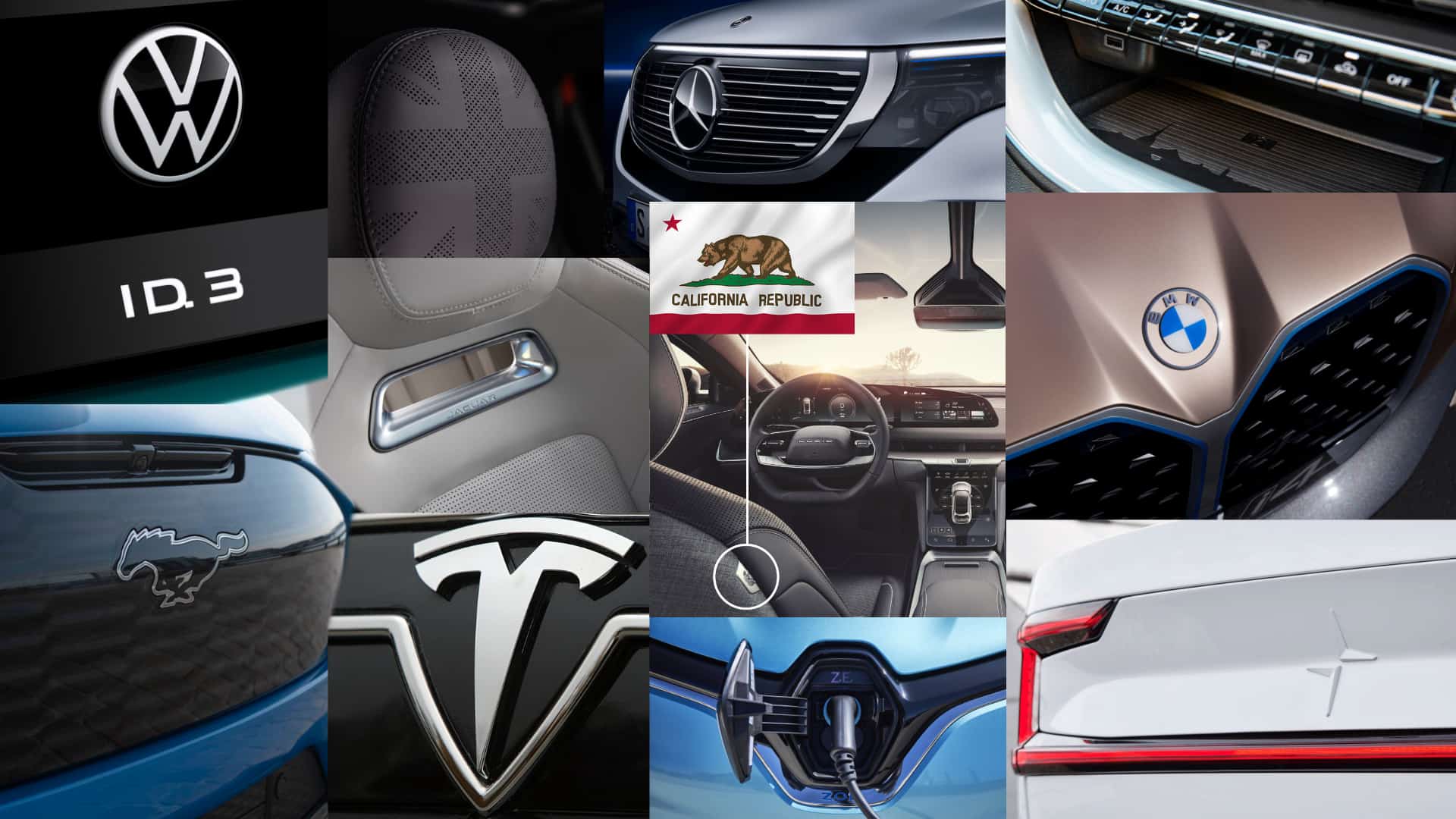
Speaking about transforming identities, we can’t go without mentioning VW’s new ID.3 and ID.4, along with the restyling of their logo. Apart from flattening the logo’s features, designers have decided to (finally) ditch the chromed exterior emblem. The new black and milky-white finish adds to a younger, more casual look.


VW ID.3 rear, logo and ID.4 perforated logotype in seat
Another detail I appreciate is the perforated ID logotype on the seat headrests. This treatment is a fresh alternative to the myriad of embossed, debossed and embroidered headrest logos out there.
Beyond Blue
BMW is another OEM that has recently launched a bold logo restyling. The Concept i4’s design shines with soft and gentle logo treatments: the previously black outer circle converts to a transparent surface. In this way, the logo becomes visually lighter with the white and blue propellers remaining the focus.


Concept i4 with new BMW logo; iX with old BMW logo
It’s interesting to note that the Bavarian carmaker sought a different approach on the BMW iX, however. Launching in 2022, the iX still sticks to the old logo design, adding a blue outline.
BMW is cleverly using its heritage blue color to convey the electric nature of its new cars. But many of its competitors are doing the same. Let’s hope the brand will transfer its intent from the Concept i4 into production to enforce its unique design language.


Renault Zoe charging; Charge point

Similarly, Renault is adding a blue outline on its logo to distinguish its electric models. The color blue has become so ubiquitous with electric vehicle designs so it’s not particularly original. However, the French brand takes a creative (and functional) twist on the front of its Zoe model. The diamond emblem mutates into a charging cap — a simple yet effective metaphor for Renault’s new electric heart.
Made of Light
Using lighting as a highlight feature and brand identifier is not new. Mercedes first illuminated its iconic three-pointed star logo back in 2013. But lately, there’s been a trend towards using lighting effects as a design signature for EVs.
As a technology-oriented car maker, Audi takes a whole different path when defining its electric identity. Rather than a redesigned logo, the E-Tron excites with graphical lighting effects.
The car welcomes its users with several unexpected logo applications: the projection on the ground when opening the door; the set of lamp animations, the backlit insert on the dashboard. This innovative approach results in an uncluttered interior, avoiding an excess of badges and dedication plates while adding a user experience element that is entirely unique to the E-Tron models.
Goliath vs. David
In the world of electric cars, the ultimate identity clash is taking place between Mercedes and Tesla, which can be interpreted as Goliath (the old world) vs. David (the new). Both brands’ contrasting philosophies reflect clearly in their logo applications.

Mercedes, as the combustion engine vehicle’s inventor, strives to maintain its supremacy against the major electric disruptor by exaggerating its logo’s dimensions. On the other hand, the American startup keeps a low profile by shrinking its front logo to the absolute minimum. This understated look helps to emphasize its core value of substance over form.


Not one logo on the front but two: a massive star on the front grille and another on the hood surrounded by a “Mercedes Benz” lettering and a laureate wreath. Time for a restyling?
Judging by the 2020 reports, EV consumers continue to ‘vote’ Tesla with their money. Let’s see if in the future Mercedes will do more for its electric leadership than just asking its designers to ‘keep calm and make the logo bigger’.
Conclusion
Given the numerous announcements that have been made since the start of 2021, it’s clear that the logo redesign is the first step in redefining the image of the company and shaping customers’ perception of electric cars. The leading trends can be summarized in the following takeaways.
Tone-on-tone effects are usurping chrome in communicating value and design expertise in the electric age, with many carmakers choosing glossy black or black & white matte finishes over the stalwart shiny reflective material appliqué. Their applications are often done through flat designs and blue detailing but remain subtle and overall discreet in appearance.
Finally, lighting effects and animations are also being presented as a means of communicating brand identity and technical prowess, which is entirely apropos for the technology revolution we’re currently witnessing within the automotive arena.